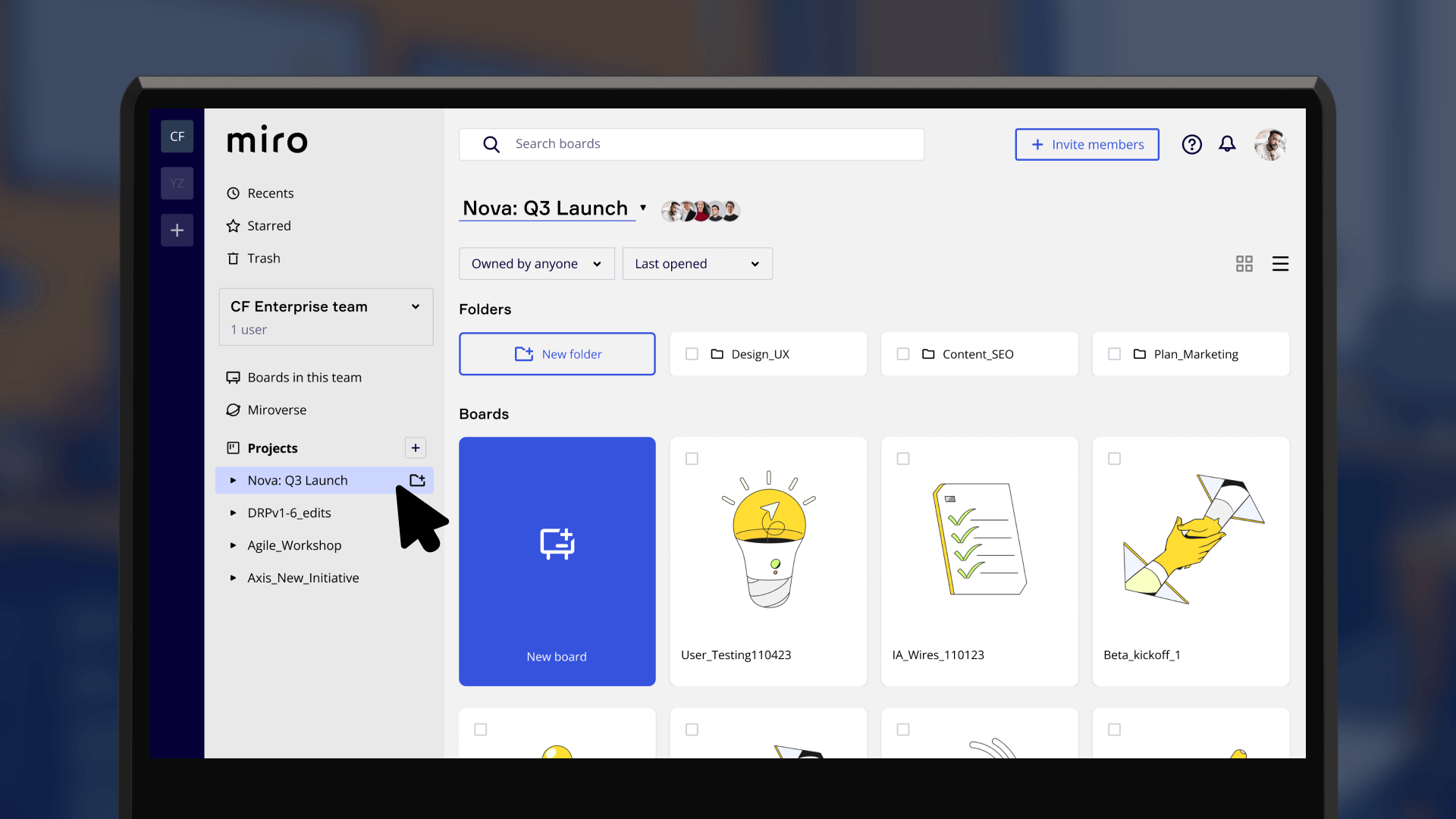
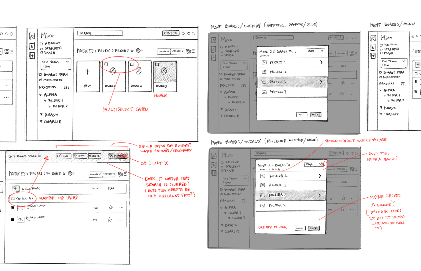
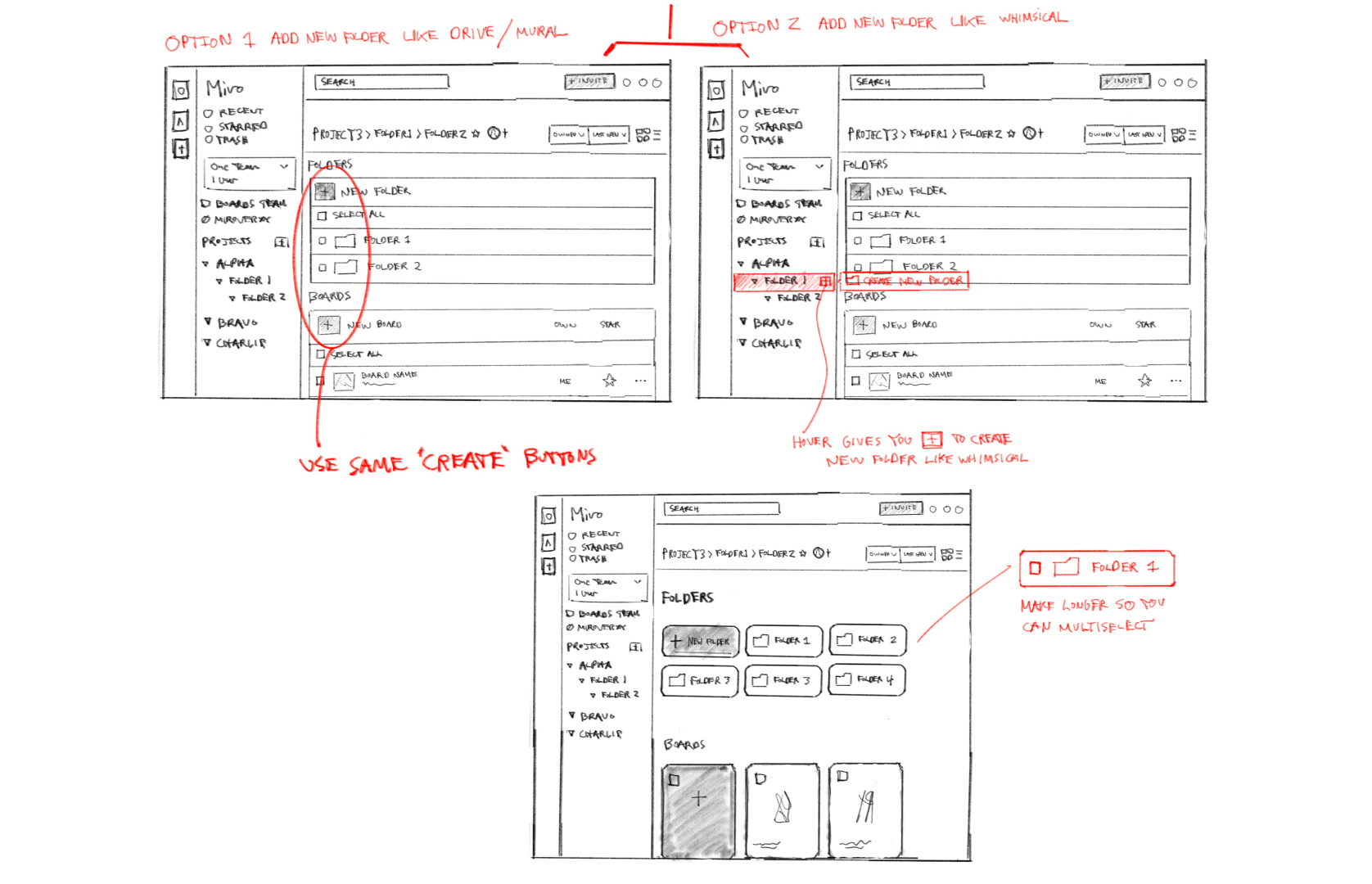
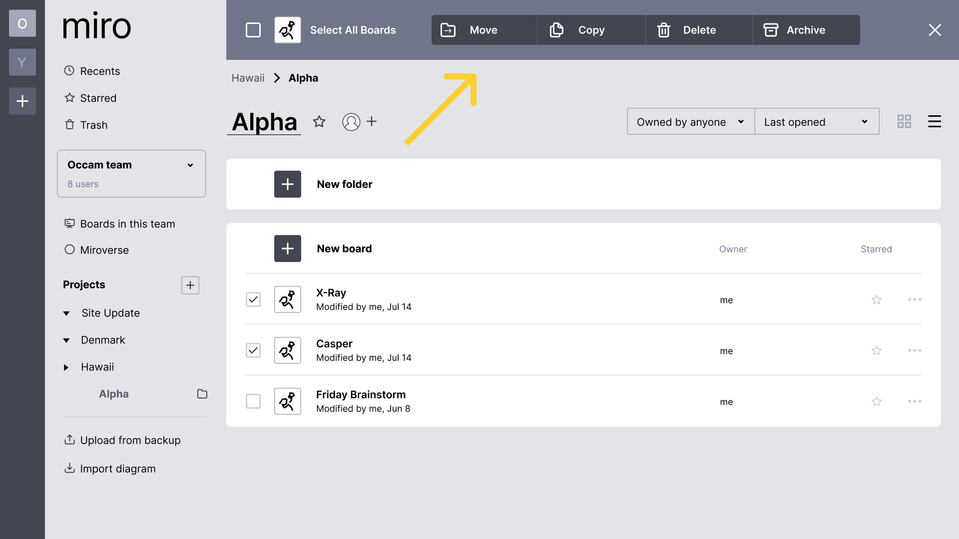
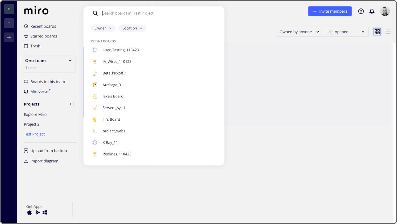
• Sidebar nav & breadcrumb nav
• Search bar
• Multi-select toolbar
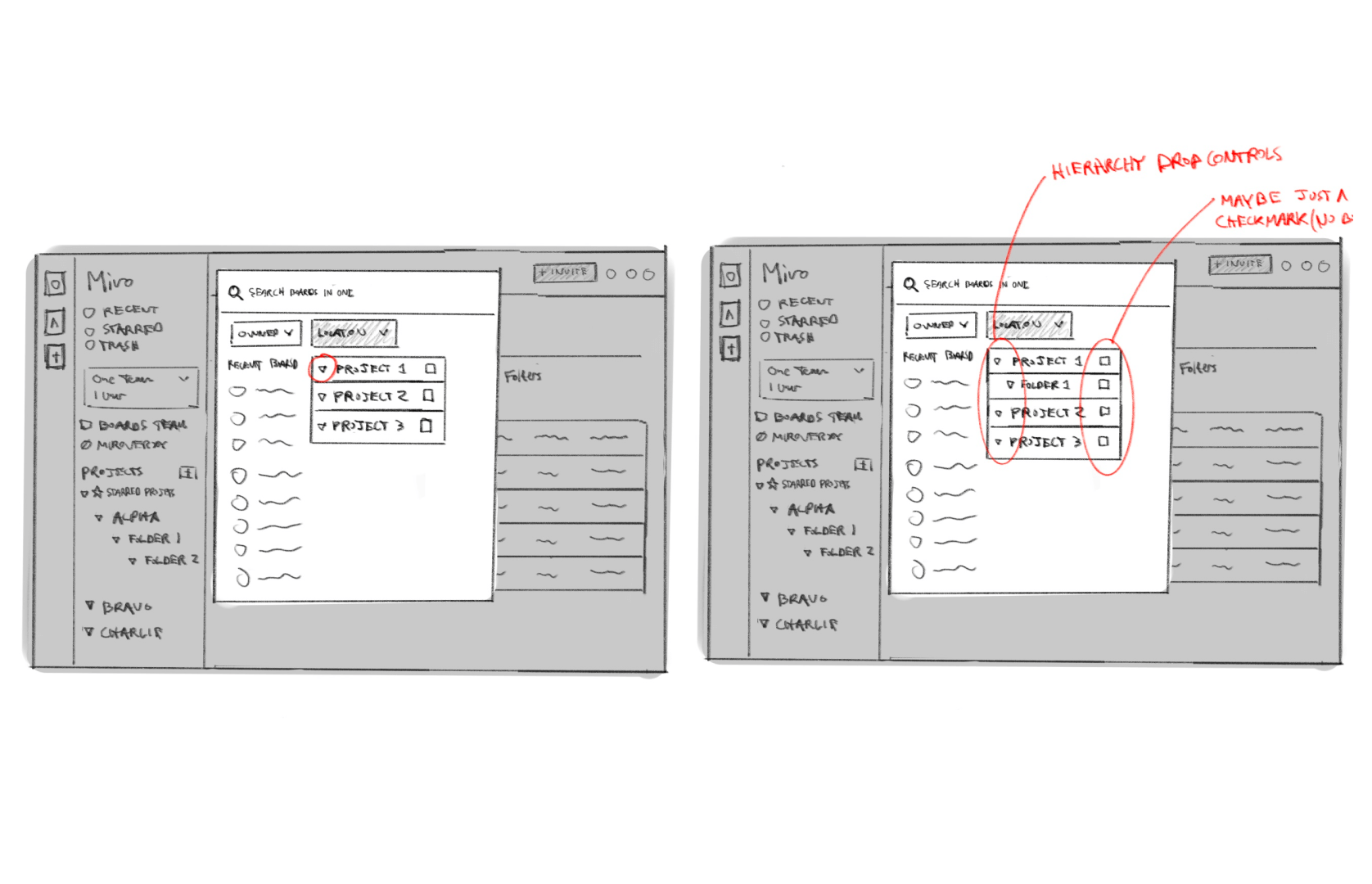
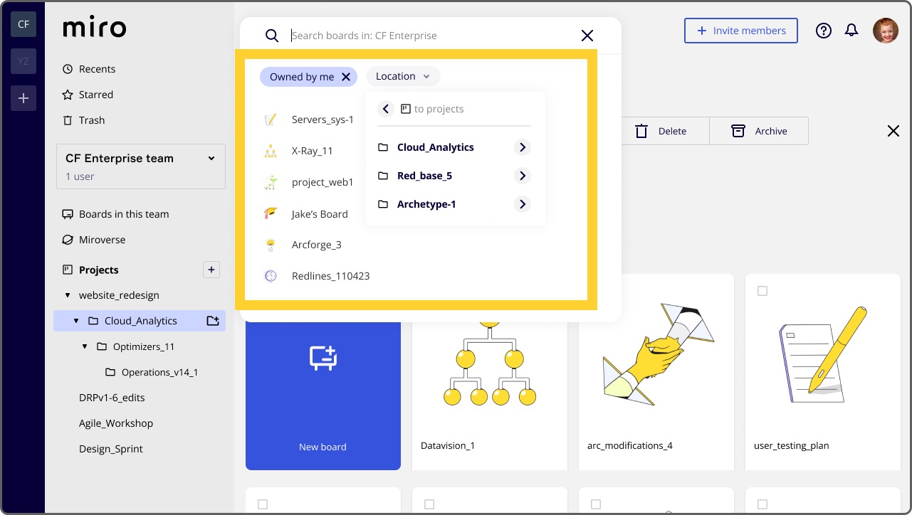
• Search bar
• Multi-select toolbar
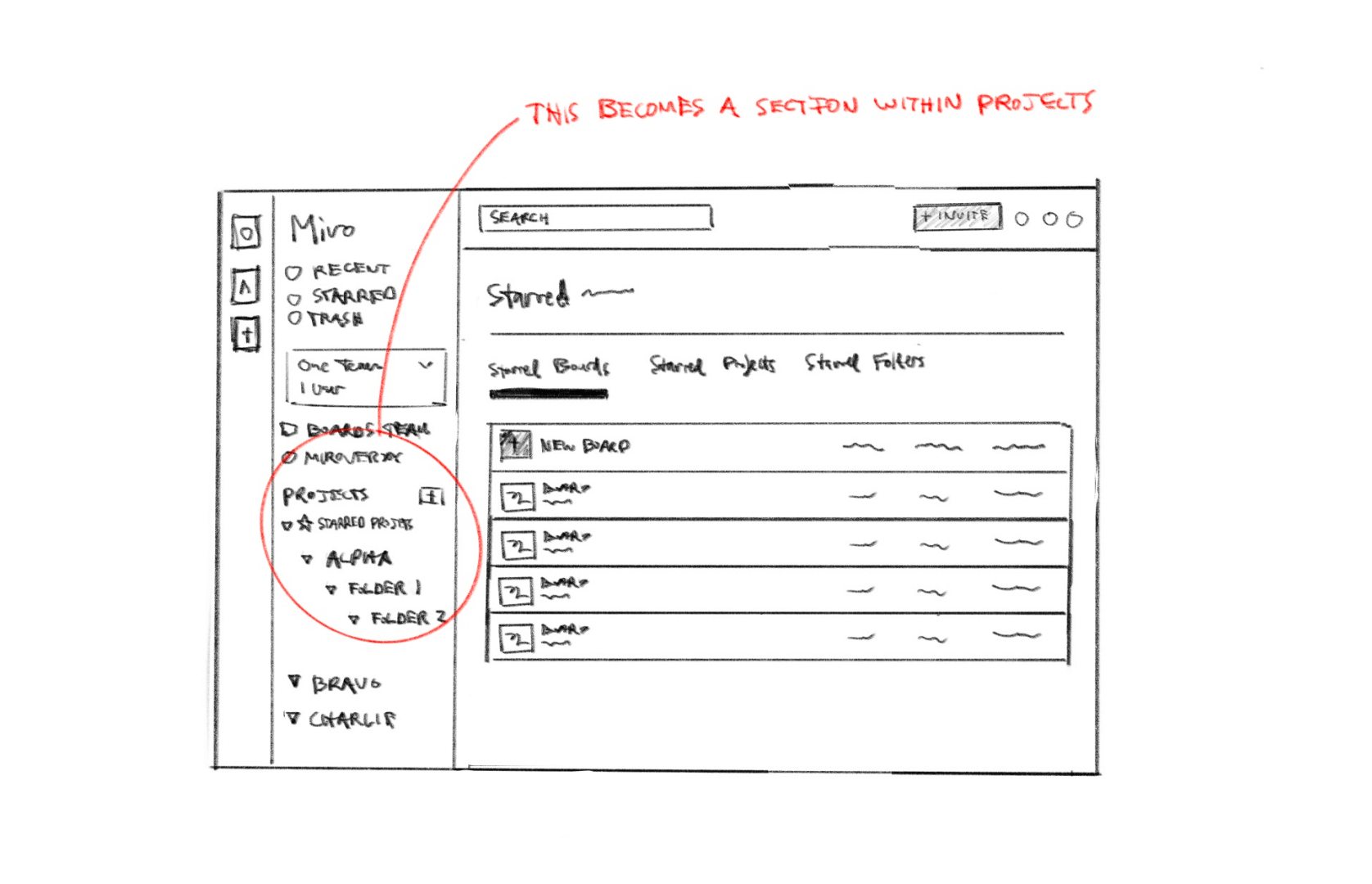
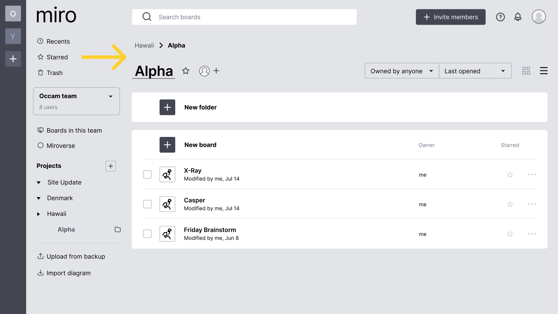
• Starred section
• Recent section
• Board & list views
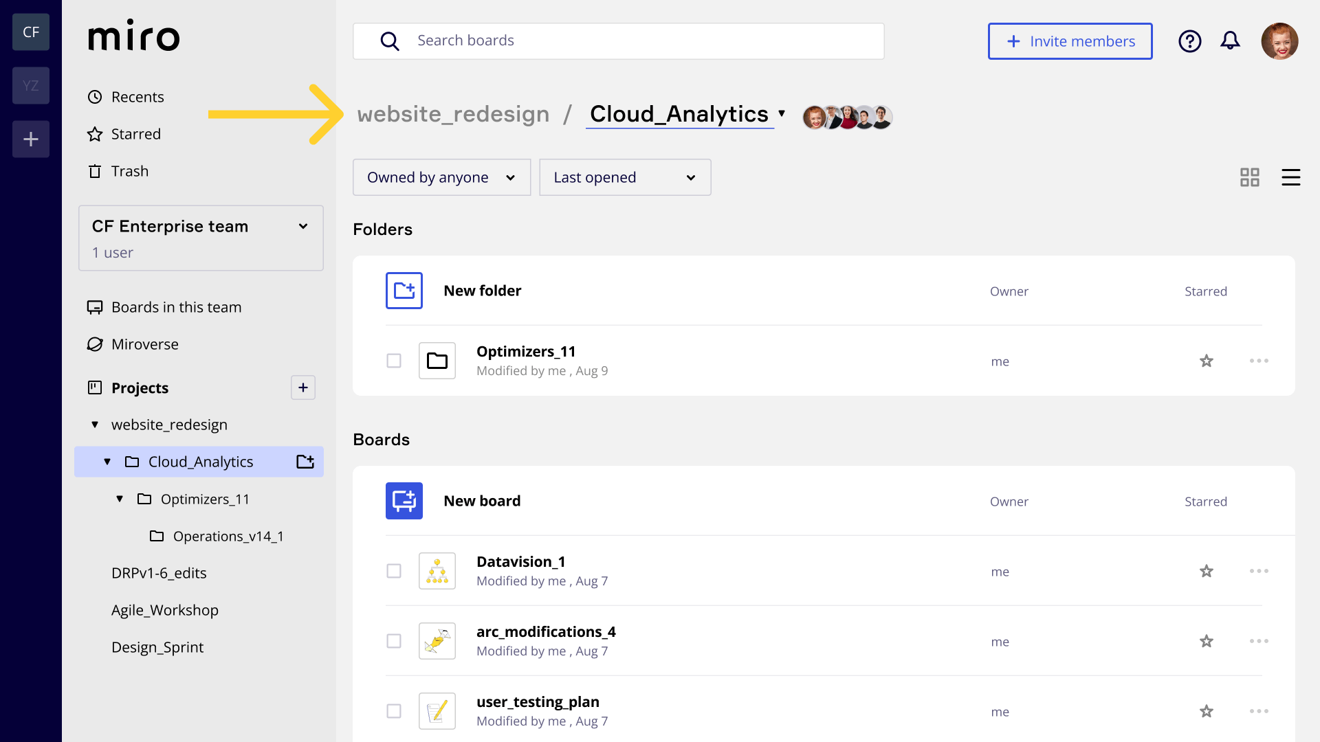
• Recent section
• Board & list views
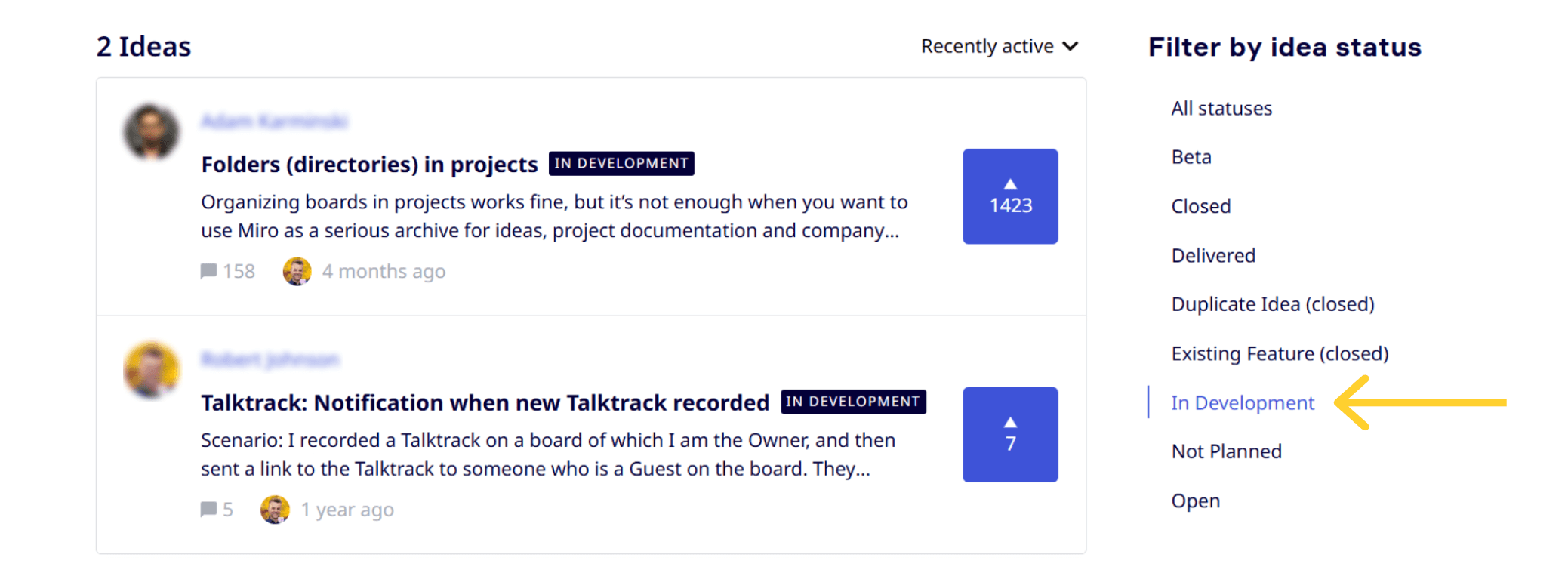
• 100% (5/5) test users completed core folder and board tasks in under 2 minutes
• 80% (4/5) said it would make finding boards easier in daily workflows
• Miro has added a similar nested folder feature to its roadmap (not yet delivered)


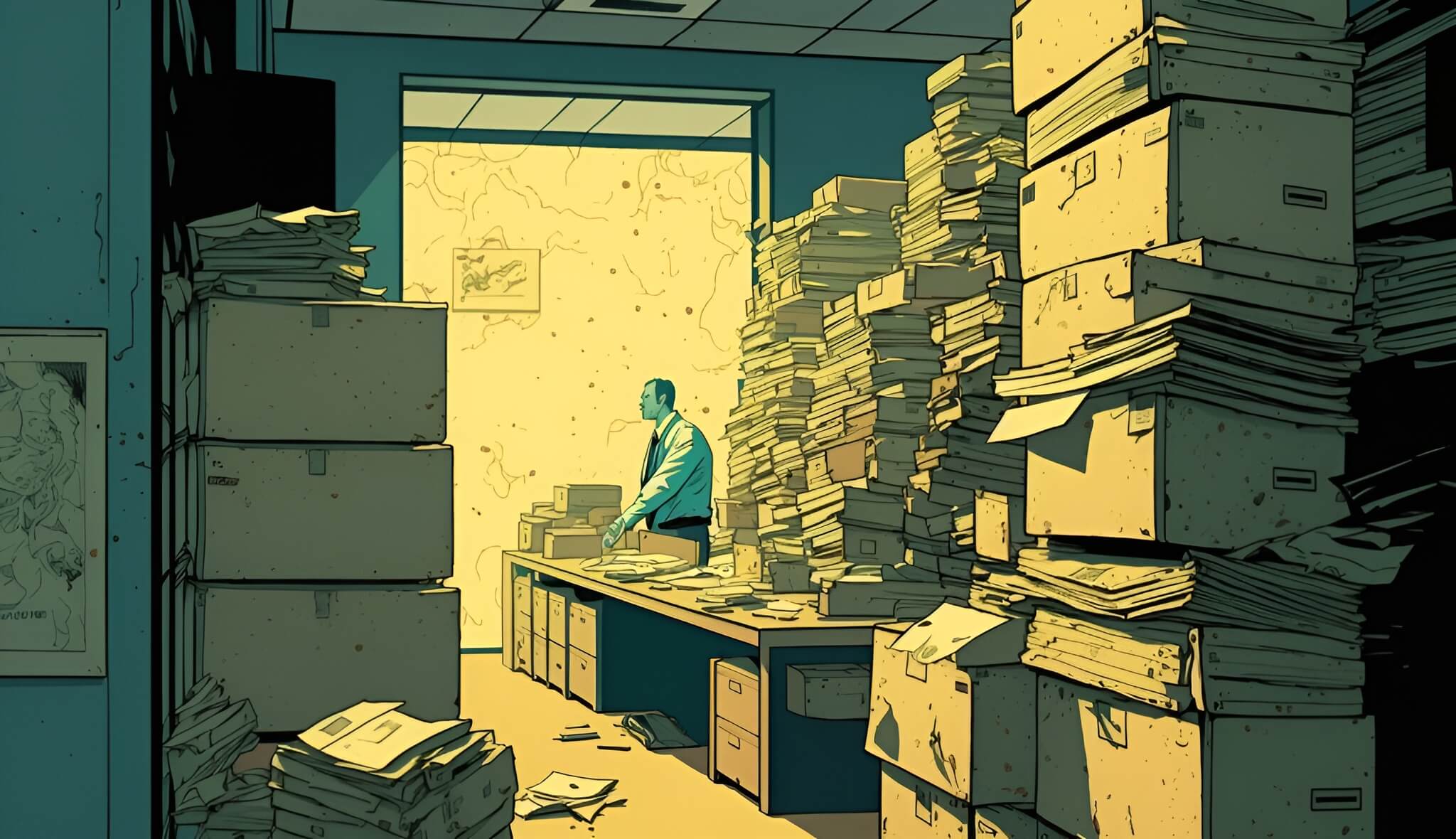
Dozens of boards pile up; difficult to manage.


Boards grouped into folders; much faster to find.

As the third most requested feature on Miro's own user forums this issue has remained unfixed for over three years.
Direct competitors like Mural, Whimsical and FigJam already provide a nested folder structure giving them a clear advantage.
“We just purchased Miro for our entire organization (150 seats)... and it's going to get messy without this feature. I'm worried that it might discourage uptake within the company.”
- Anton T. / Miro Forum Comment
• Time is wasted searching for existing work.
• Workspaces feel chaotic and unprofessional.
• It's impossible to create a scalable system.

• It undermines the brand efficiency promise.
• It hands a major advantage to competitors.
• It creates a barrier to adoption at larger orgs.


Want to see this feature set in action?
View Prototype >
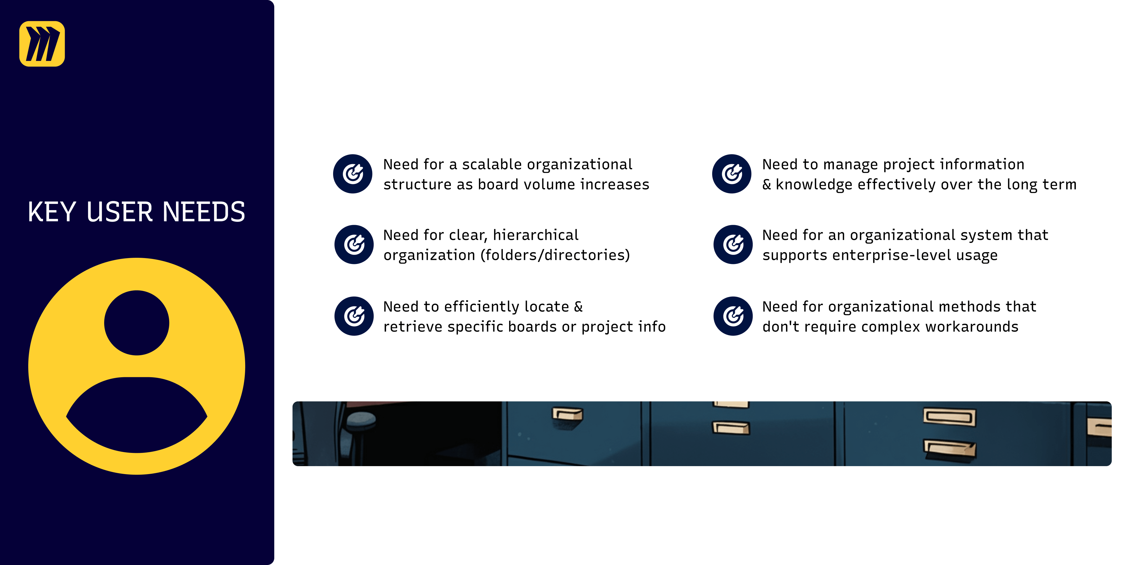
Projects with 5-7+ boards turn chaotic, especially in large orgs with 60+ boards. Users call it “unusable,” craving intuitive structure to tame the sprawl.
PROOF: 20+ forum comments calling for subfolders.
Poor organization deters larger org uptake. Users fear wasted licenses as cluttered boards hinder company-wide adoption, per forum gripes.
PROOF: 5+ forum comments flagged this as a blocker.
No native folders force “unscalable” workarounds, like sticky-note directories. Users lament high-maintenance hacks, craving seamless organization.
PROOF: 8+ comments mention currently using workarounds.
Users say tags lack discoverability. Rigid folder hierarchies build clearer mental models, simplifying permissions for large orgs’ knowledge bases.
PROOF: 10+ comments stressed tags need to be secondary to folders.
“With just tags, I wouldn't be able to help my employees understand the structure I use to think about our daily operations.”
- Adam K. / Miro Forum Comment


My experience as a freelancer has taught me to be pragmatic and make strategic trade-offs when faced with tight deadlines.
With a traditional interview process being a luxury I couldn’t afford, I instead used Miro’s public forums as a faster, more direct source for a wealth of user feedback.
This approach allowed me to save a significant amount of time while ensuring the solution was validated by a broad user base.
FORUM ANALYSIS:
• How are users describing their pain points and what do they use as workarounds?
• How many layers of hierarchy is appropriate?
• How do I need to approach folders vs. tags and do I need to investigate further regarding permissions?
SECONDARY RESEARCH
Competitor Analysis - Heuristic Evaluation
• What are the industry standards and how do competitors approach this problem?
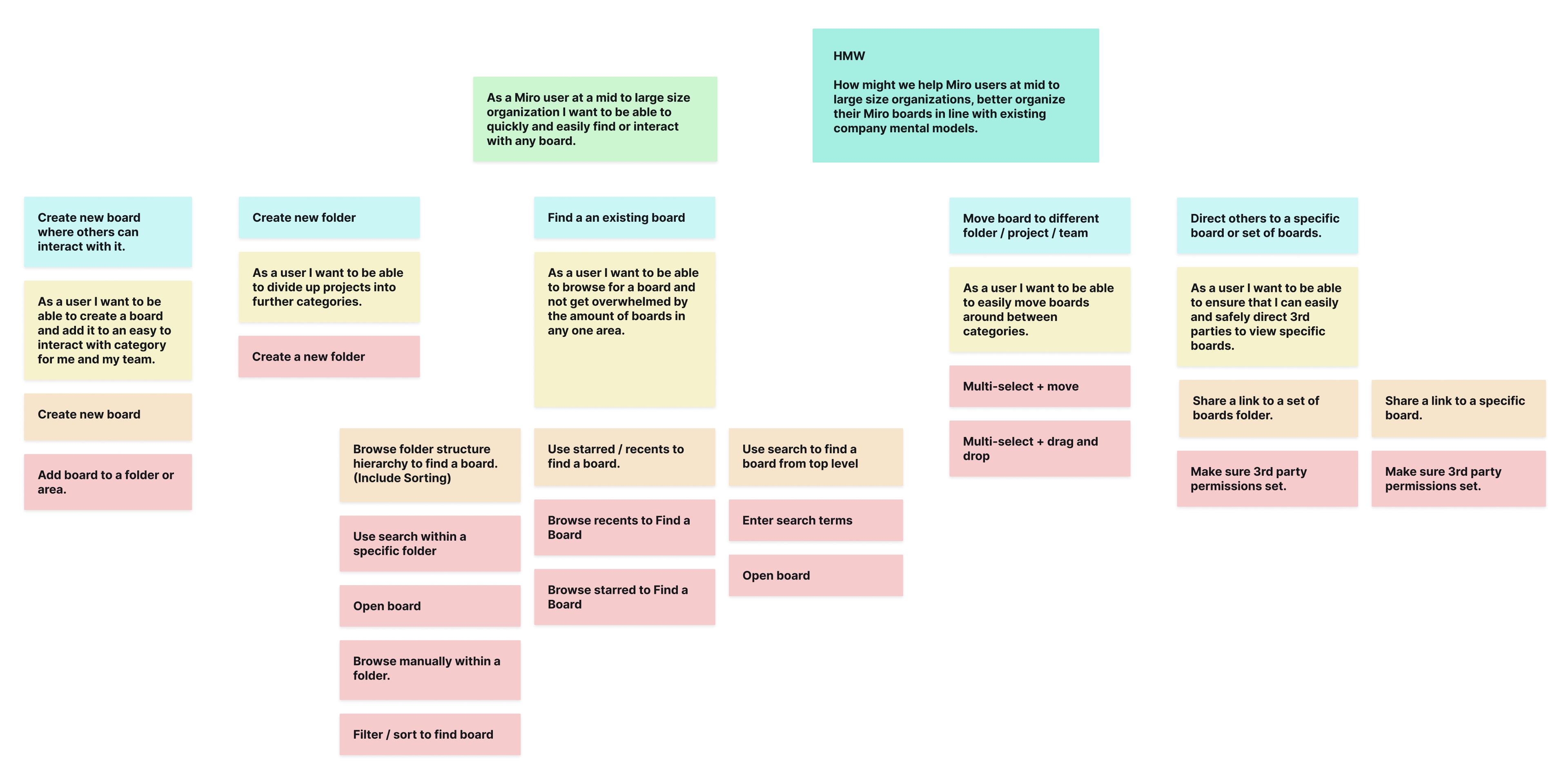
My three goals:
• 1. FRAMING: Map research insights into specific feature sets to define next steps.
• 2. GROUNDING: Ground all designs in established UI pattern best practices for immediate usability.
• 3. SYNTHESIZING: Synthesize all user needs to serve as a "north star" for the project.


I built a mid-fi prototype and was looking to answer:
• EXPECTATIONS: Does this new folder architecture match the way users expect it to work?
• FRICTION: What happens when users interact with search, and where are the pain points?
• CONTEXT: Have I implemented the hierarchy tools in all the right places where users will actually need them most?
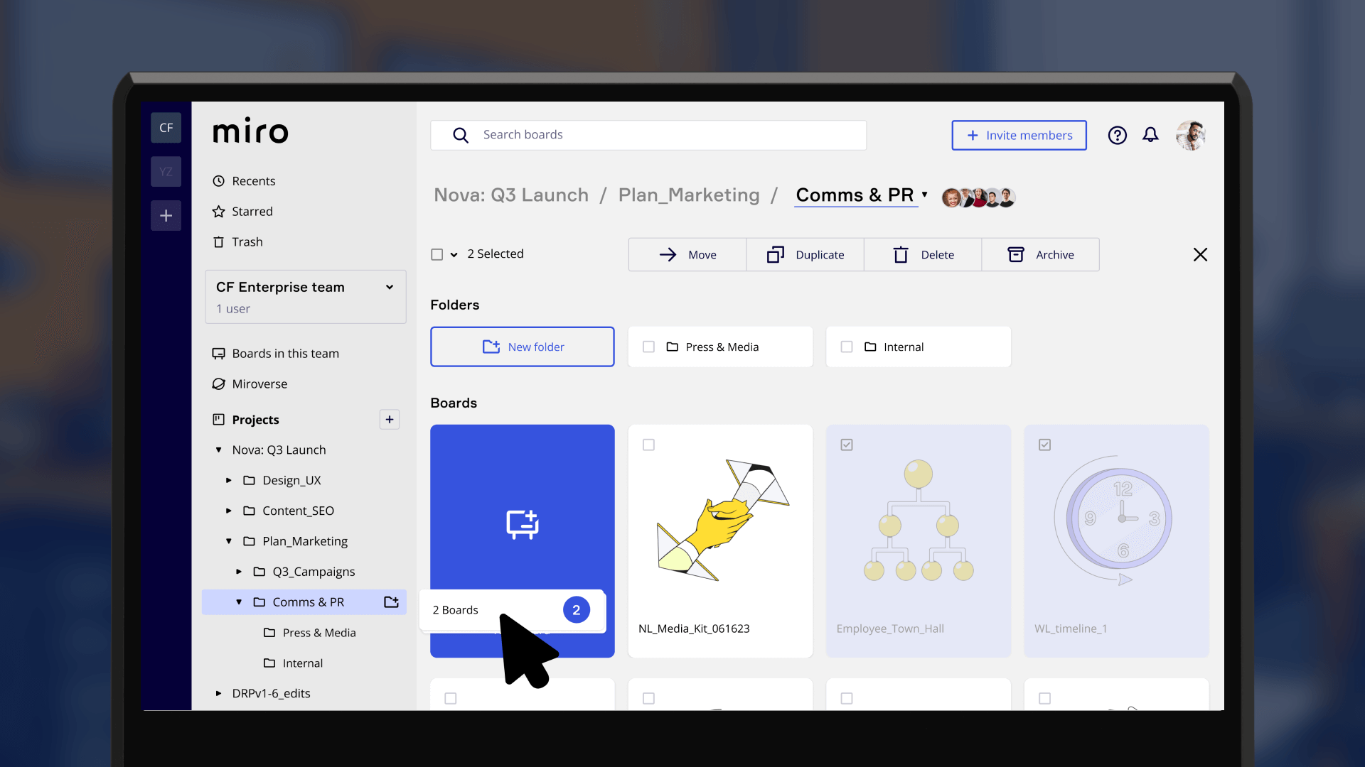
BEFORE: The multi-select bar sat at the very top of the window.
AFTER: I moved it directly above folders and boards.
WHY THE CHANGE? One tester took 25+ seconds to connect the two areas. Moving the bar improved efficiency and aligned with the user need for faster retrieval.
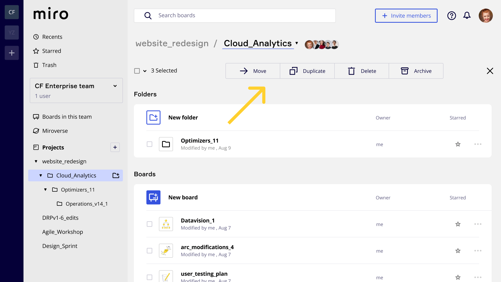
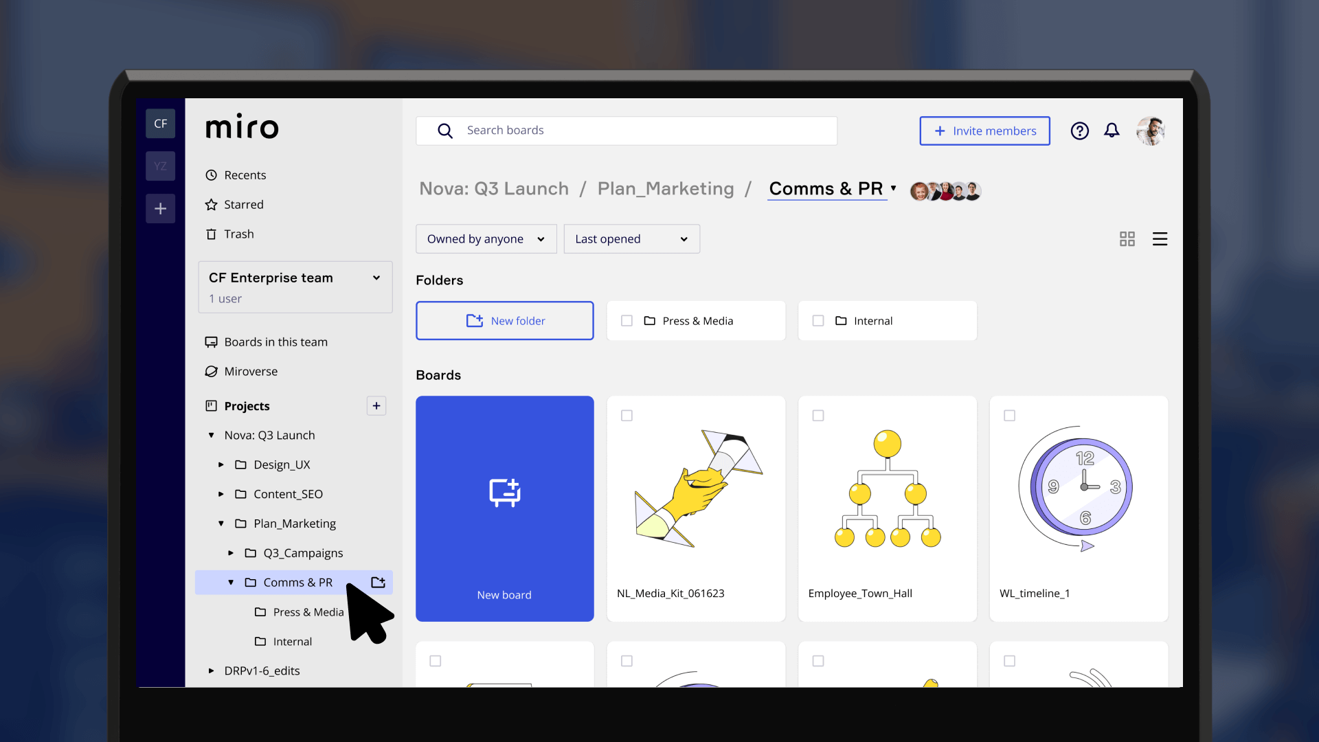
BEFORE: 40% of testers were confused by duplicate labels — a breadcrumb trail plus a project / folder title.
AFTER: I simplified the layout using a more familiar Google Drive style pattern.
WHY THE CHANGE? This clarified hierarchy and met the core need for clear organization.
WHAT: 4/5 users tried to drag and drop files during tests unprompted. There was a clear expectation that multi-selecting would be accompanied by drag and drop.
CHANGE: Drag and drop functionality was added.
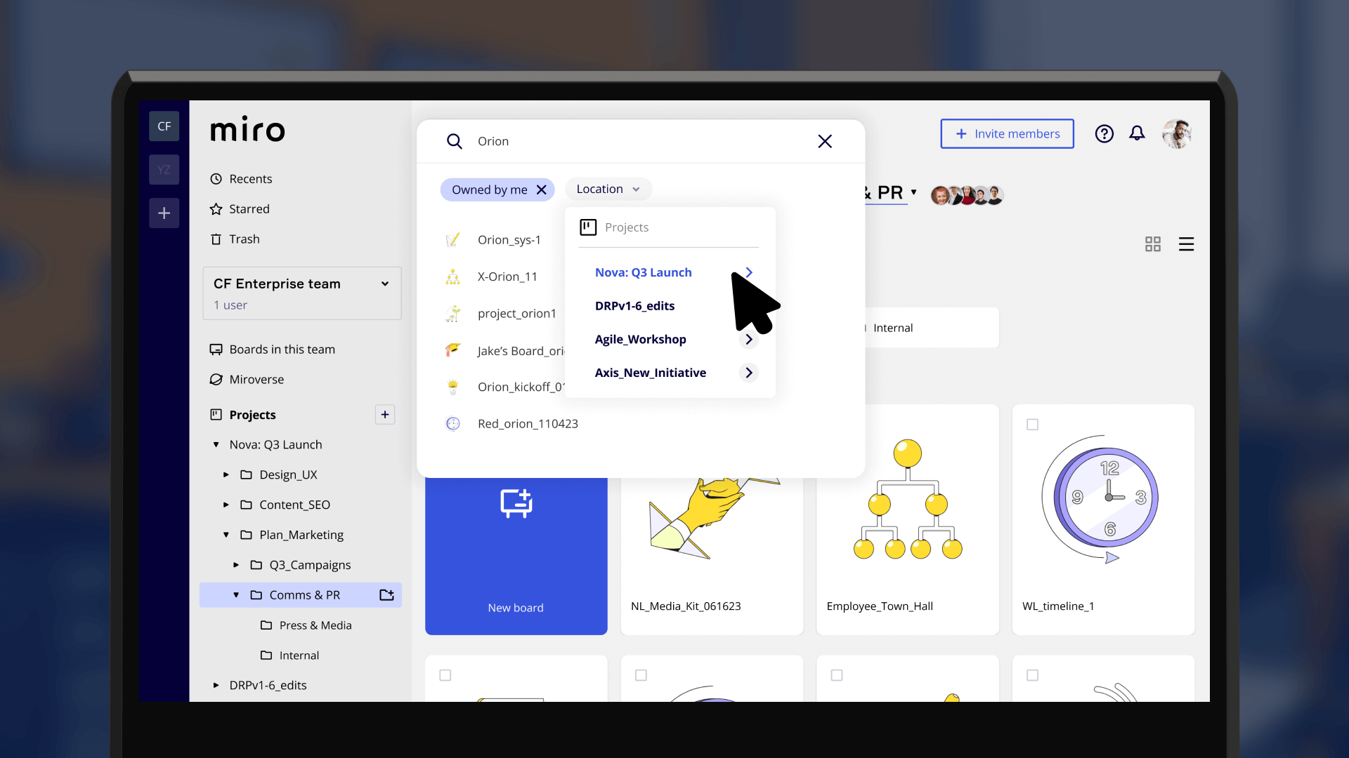
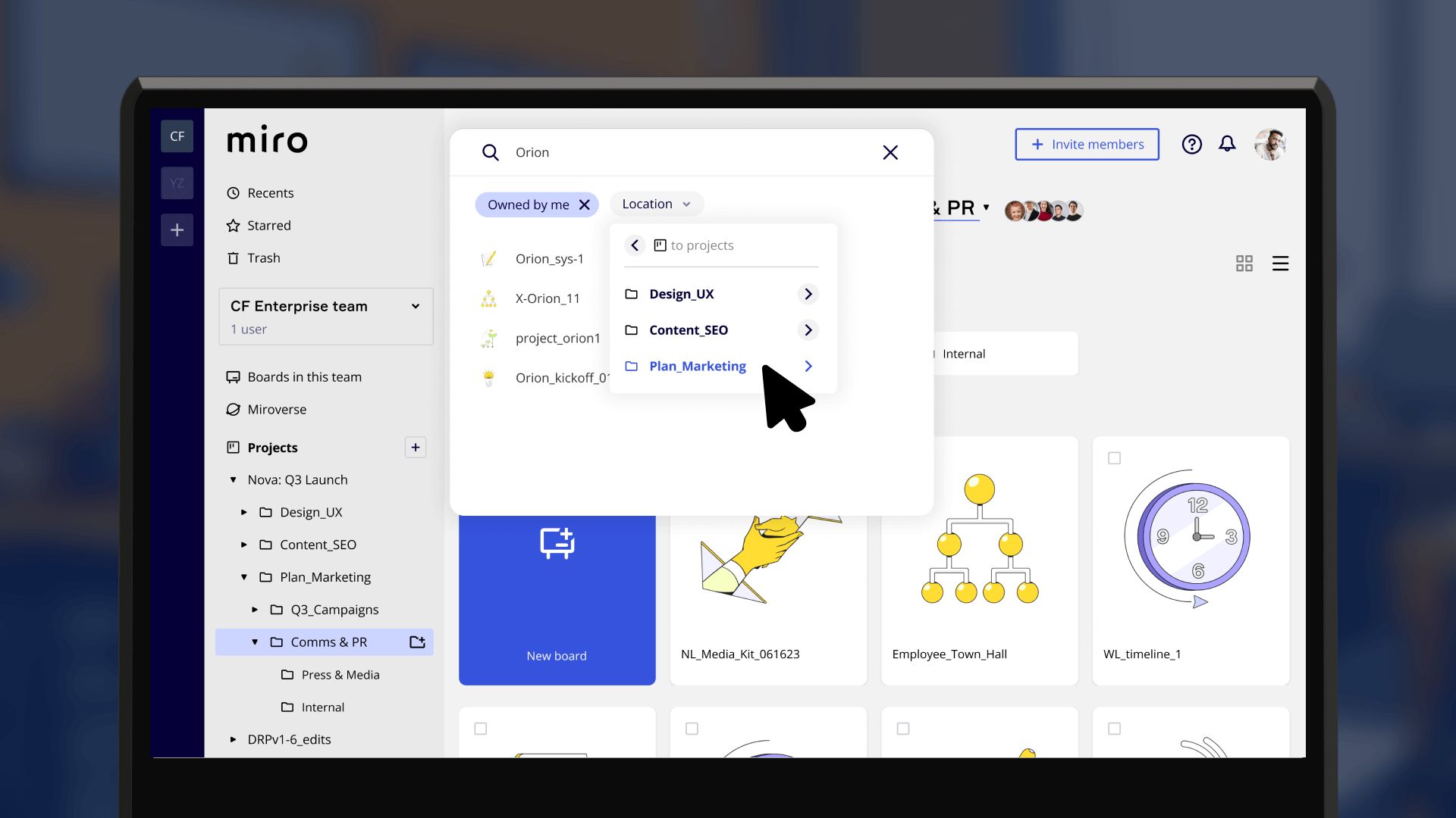
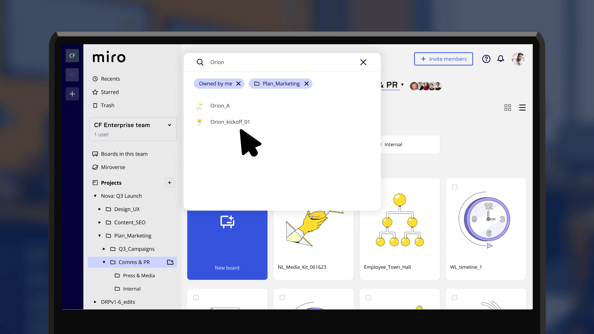
WHAT: 3/5 users started out looking for boards via search (vs. browsing).
CHANGE: Previously searching could be scoped to projects only. Now users can scope search to any of the x4 hierarchy layers (project or x3 folders).
All x5 participants successfully completed the core file management tasks, including creating new folders and moving multiple boards.
IMPACT: This proves the new information architecture and Ul patterns are intuitive and have a low learning curve for existing Miro users.
Every participant (5/5) independently described the new folder system as "intuitive" or" straightforward" during post-test interviews.
IMPACT: This unanimous positive feedback confirms the design successfully addresses the core user frustration of a disorganized workspace.


All x5 testers completed file management tasks with no errors — proof the feature was highly intuitive and fast to learn and use.
IMPACT: Major time savings compared to endlessly hunting in a flat file structure.
Months later, the thread on this feature was moved to "In Development" on Miro's roadmap — the problem was a company priority.
IMPACT: validated I was working on a strategically aligned solution.
4 / 5 testers said the new tools made finding boards significantly easier in their daily workflows and were enthusiastic about the solution.
IMPACT: Reduces frustration and lowers the risk of users abandoning for competitors.
"Being able to pull your team's action items, share them, you're just eliminating such like a communication backlog..."
"It just saves you so much time from having to find all of those action items, write the email, send it out, etc."
- Erin T. - Startup COO
“I think it's easier if companies keep it more organized like this. Our current Miro setup is quite the mess… it's now like 80 or something boards under one project.””
- Phillip R. / Software Engineer

This project was a masterclass in pragmatic problem-solving. Under a tight deadline, I honed my ability to be resourceful, validate early, and scope intelligently. I proved that even without insider access, a powerful solution can be designed by keeping users at the center.
In my next role, I’ll bring the same adaptive approach to turn ambiguity into measurable value for the business and its users.
I pivoted from interviews to analyzing Miro’s feature request forums.
This trade-off sped up discovery and surfaced, user feedback a typical plan might have missed.
In testing, 80% of users instinctively tried drag-and-drop — even though it didn’t exist.
That behavior revealed a hidden need and drove a more intuitive design.
I’d track average time-to-find-boards as a proxy for productivity.
Success would be a link between faster retrieval and lower churn — proving the value of scalable organization for large teams.
Next, I’d explore tags that complement folders — giving users flexible ways to organize and filter content.
This addresses a frequent forum request for a more robust system.

